第一章 R语言基础
1.1 软件及依赖包的安装
install.packages("tidyverse")
install.packages("gcookbook")
1.2 加载R包
library(ggplot2)
library(dplyr)
library(gcookbook)
1.3 读取以逗号分隔的文本文件(CSV)
data <- read.csv("datafile.csv")
data <- read.csv("datafile.csv", header = FALSE)
names(data) <- c("Column1", "Column2", "Column3") #给列重命名
data <- read.csv("datafile.csv", sep = "\t") #读入数据后,以制表符分隔
提示1:关于factor(因子)
假如下面是你的数据集:
“First”,”Last”,”Sex”,”Number”
“Currer”,”Bell”,”F”,2
“Dr.”,”Seuss”,”M”,49
””,”Student”,NA,21
使用read.csv()函数读入数据集后,默认会将First和Last储存为Factor,但在本例中,它们为字符串。为了区分,需要是使用如下命令:
data <- read.csv("datafile.csv", stringsAsFactors = FALSE)

# Convert to factor
data$Sex <- factor(data$Sex)
str(data)

#> 'data.frame': 3 obs. of 4 variables:
#> $ First : chr "Currer" "Dr." ""
#> $ Last : chr "Bell" "Seuss" "Student"
#> $ Sex : Factor w/ 2 levels "F","M": 1 2 NA
#> $ Number: int 2 49 21
1.4 读取来自Excel的文件
install.packages("readxl")

library(readxl)
data <- read_excel("datafile.xlsx", 1) #读取第一个sheet
data <- read_excel("datafile.xls", sheet = 2) #读取第二个sheet
data <- read_excel("datafile.xls", sheet = "Revenues") #读取名为“Revenues”的sheet
read_excel()使用表格的第一行作为列名,可用col_names = FALSE来取消指定。
read_excel()会指定列数据的类型,可用col_types来自定义。
# Drop the first column, and specify the types of the next three columns
data <- read_excel("datafile.xls", col_types = c("blank", "text", "date", "numeric"))
1.5 读取来自SPSS/SAS/Stata的文件
read_sav()可用于读入来自SPSS的文件,read_sas()可用于读入来自SAS的文件, read_dta()可用于读入来自Stata的文件。
# Only need to install the first time
install.packages("haven")

library(foreign)
data <- read_sav("datafile.sav")
data <- read_sas("datafile.sas")
data <- read_dta("datafile.dta")
第二章 快速浏览数据
2.1 创建散点图
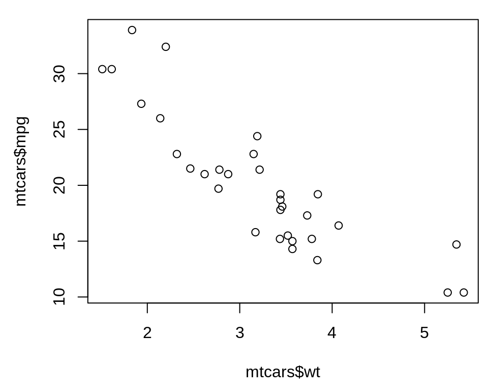
2.1.1 使用R自带的base包创建散点图(plot)
#基于R自带的base包

library(gcookbook)
plot(mtcars$wt, mtcars$mpg)
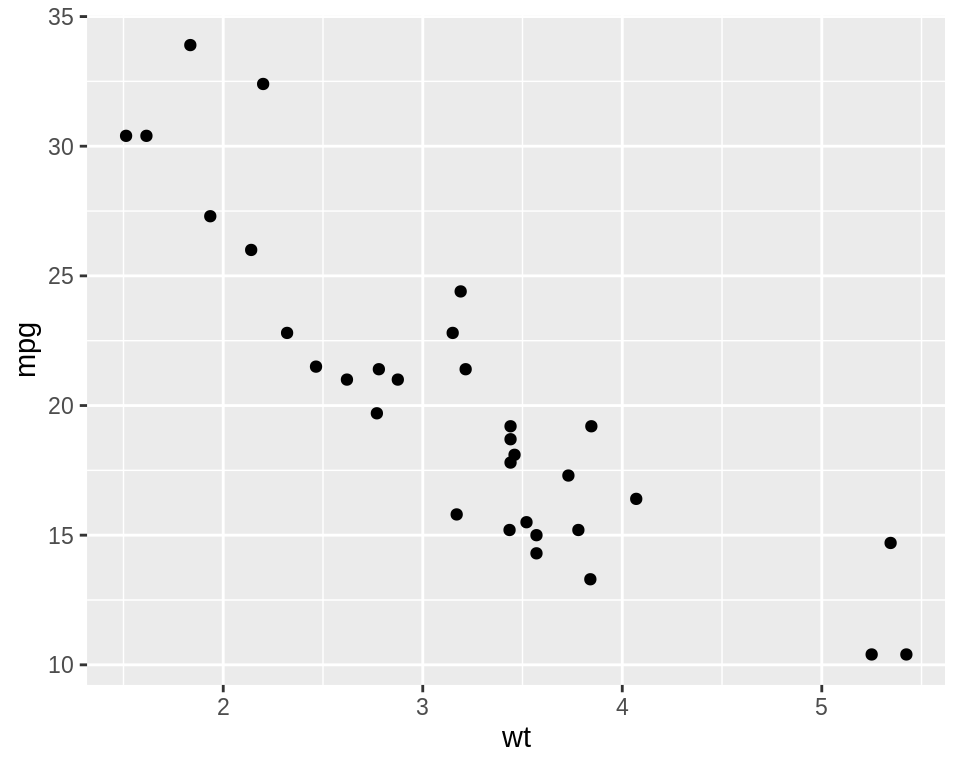
2.1.2 使用ggplot2包创建散点图(geom_point)
#基于ggplot2包

library(ggplot2)
ggplot(mtcars, aes(x = wt, y = mpg)) +
  geom_point()
2.2 创建折线图
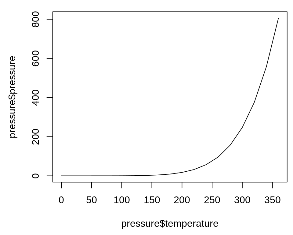
2.2.1 使用R自带的base包创建折线图(plot、points、lines)
#基于R自带的base包
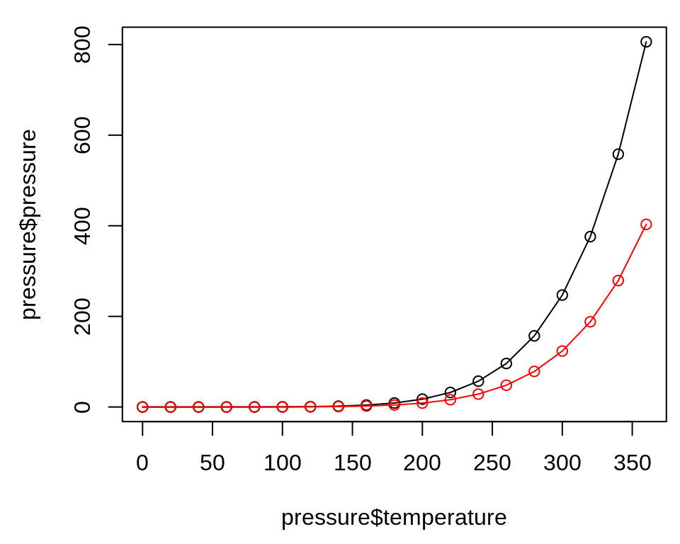
plot(pressure$temperature, pressure$pressure, type = "l")
如要进一步添加点/线,首先需要调用plot()函数,然后使用points()函数来添加点或使用lines()函数来添加其他线:
plot(pressure$temperature, pressure$pressure, type = "l")
points(pressure$temperature, pressure$pressure)

lines(pressure$temperature, pressure$pressure/2, col = "red")
points(pressure$temperature, pressure$pressure/2, col = "red")
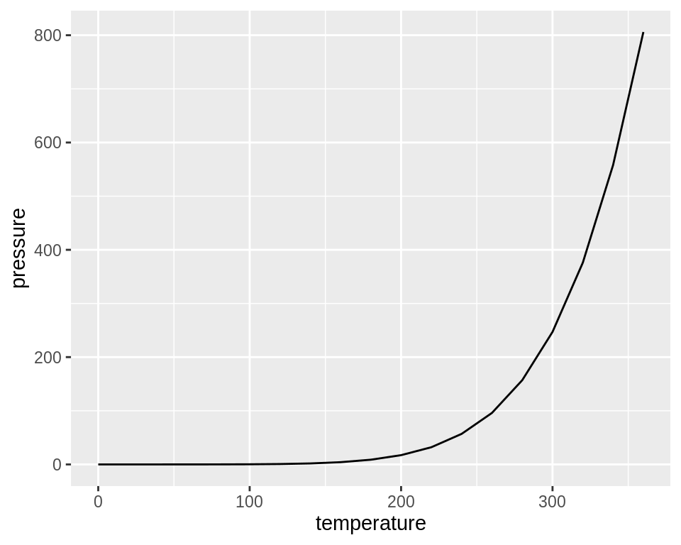
2.2.2 使用ggplot2包创建折线图(geom_line)
#基于ggplot2包

library(ggplot2)
ggplot(pressure, aes(x = temperature, y = pressure)) +
 geom_line()
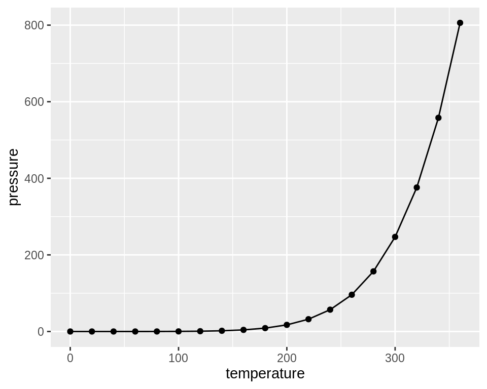
如还需创建散点图,则进一步使用geom_point()函数进行图层叠加:
ggplot(pressure, aes(x = temperature, y = pressure)) +
  geom_line() +
  geom_point()
2.3 创建条形图
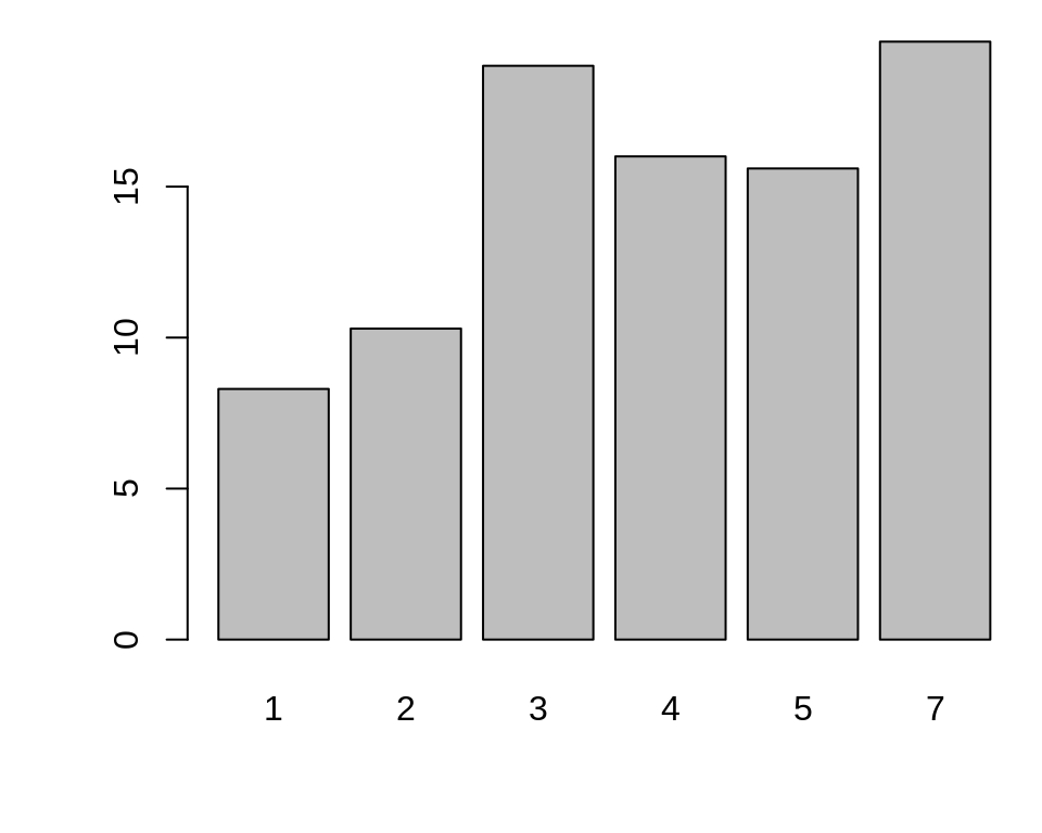
2.3.1 使用R自带的base包创建条形图(barplot)
# First, take a look at the BOD data
BOD
#>   Time demand
#> 1    1    8.3
#> 2    2   10.3
#> 3    3   19.0
#> 4    4   16.0
#> 5    5   15.6
#> 6    7   19.8


barplot(BOD$demand, names.arg = BOD$Time)
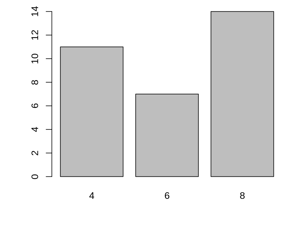
有时,“条形图”指的是每个特定类别出现的次数,这与直方图有点类似,但条形图的x轴一般是离散的。要生成向量中每个唯一值的计数,请使用table()函数:
# There are 11 cases of the value 4, 7 cases of 6, and 14 cases of 8
table(mtcars$cyl)

# Generate a table of counts
barplot(table(mtcars$cyl))
2.3.2 使用ggplot2包创建条形图(geom_col)
可以使用ggplot2包中的geom_col()函数来创建条形图。注意x变量是连续变量和离散变量时输出的差异。
library(ggplot2)

# Bar graph of values. This uses the BOD data frame, with the
# "Time" column for x values and the "demand" column for y values.
ggplot(BOD, aes(x = Time, y = demand)) +
  geom_col()

# Convert the x variable to a factor, so that it is treated as discrete
ggplot(BOD, aes(x = factor(Time), y = demand)) +
  geom_col()
ggplot2也可以用于绘制每个特定类别出现的次数,此时需要使用的是geom_bar()函数而非geom_col()函数。再次注意连续的x轴和离散的x轴之间的区别。对于某些类型的数据,使用factor()函数将连续的x变量转换为离散的变量可能更有意义。
# Bar graph of counts This uses the mtcars data frame, with the "cyl" column for
# x position. The y position is calculated by counting the number of rows for
# each value of cyl.
ggplot(mtcars, aes(x = cyl)) +
  geom_bar()

# Bar graph of counts
ggplot(mtcars, aes(x = factor(cyl))) +
  geom_bar()
2.4 创建柱形图
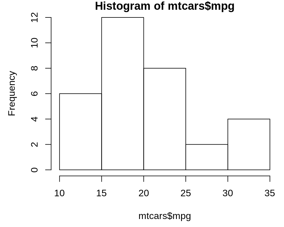
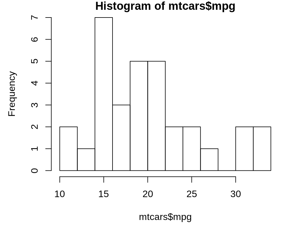
2.4.1 使用R自带的base包创建直方图(hist)
hist(mtcars$mpg)

# Specify approximate number of bins with breaks
hist(mtcars$mpg, breaks = 10)
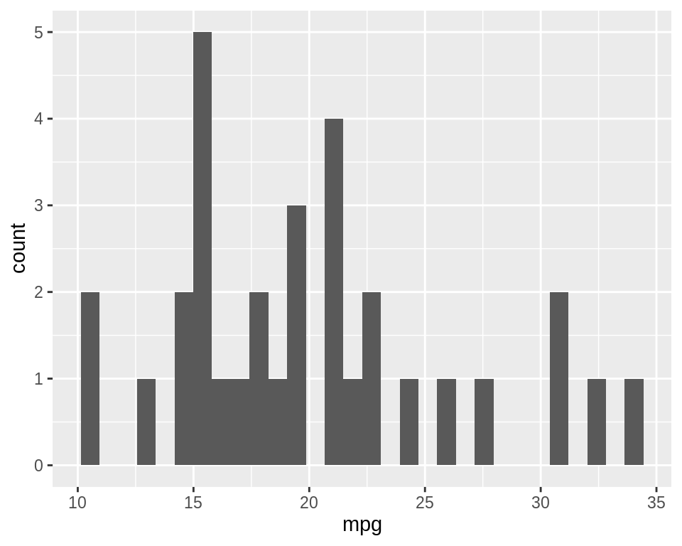
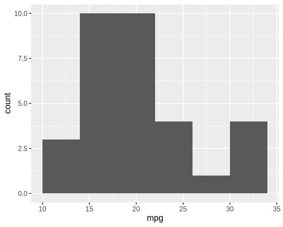
2.4.2 使用ggplot2包创建直方图(geom_histogram)
library(ggplot2)
ggplot(mtcars, aes(x = mpg)) +
  geom_histogram()
#> `stat_bin()` using `bins = 30`. Pick better value with `binwidth`.

# With wider bins
ggplot(mtcars, aes(x = mpg)) +
  geom_histogram(binwidth = 4)
2.5 创建箱线图
2.5.1 使用R自带的base包创建箱线图(plot)
可以使用plot()函数来绘制箱线图(图2.10)。当X的值为factor,y的值为向量时,它该函数将自动创建箱形图:
plot(ToothGrowth$supp, ToothGrowth$len)
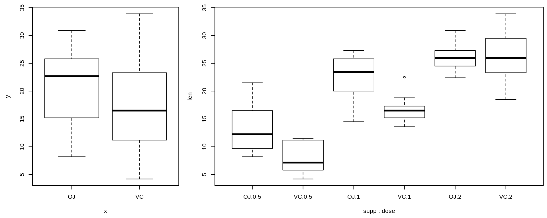
如果两个向量在同一个data frame中,则可以使用boxplot()函数及公式语法来创建箱线图,如上图2:
# Formula syntax
boxplot(len ~ supp, data = ToothGrowth)

# Put interaction of two variables on x-axis
boxplot(len ~ supp + dose, data = ToothGrowth)
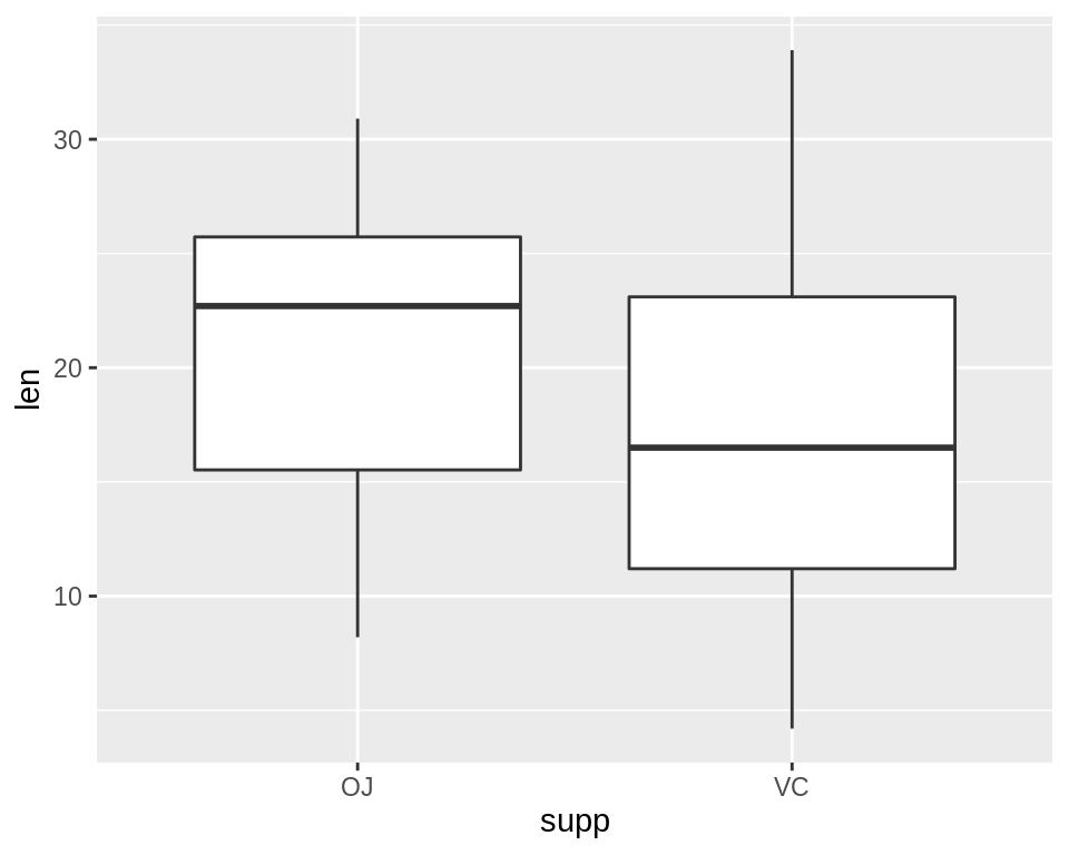
2.5.2 使用ggplot2包创建箱线图(geom_boxplot)
library(ggplot2)
ggplot(ToothGrowth, aes(x = supp, y = len)) +
  geom_boxplot()
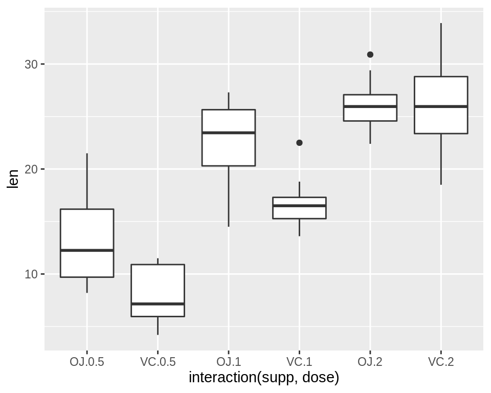
此外,还可以通过将vector与interact()函数相结合,从而绘制出多变量箱线图:
ggplot(ToothGrowth, aes(x = interaction(supp, dose), y = len)) +
  geom_boxplot()
2.6 绘制功能曲线
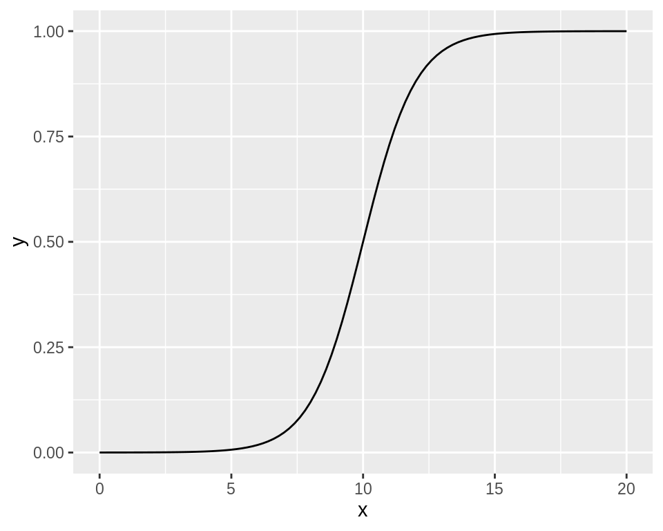
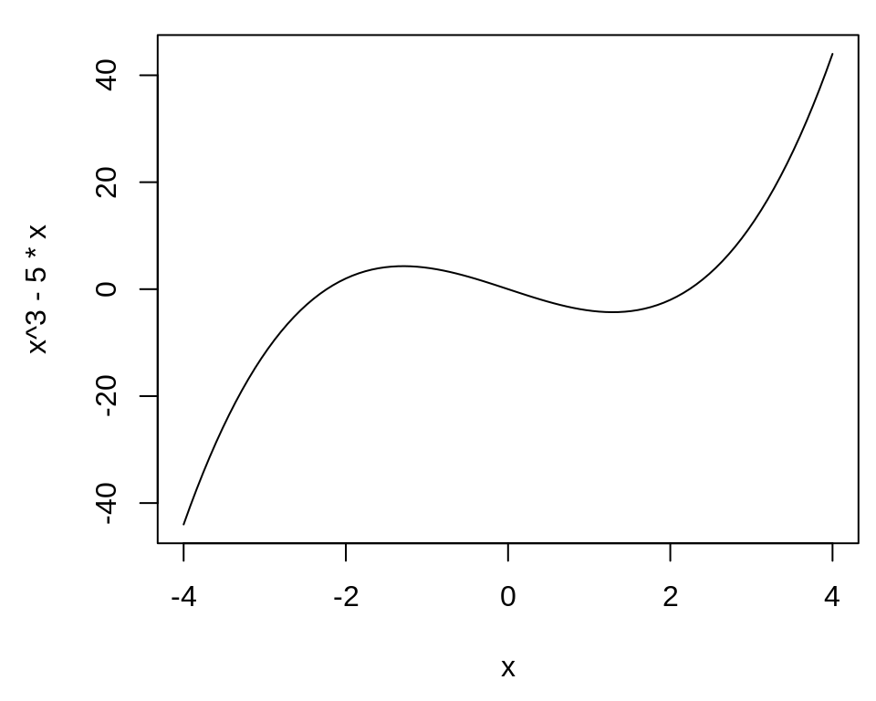
2.6.1 使用R自带的base包绘制功能曲线(curve)
curve(x^3 - 5*x, from = -4, to = 4)
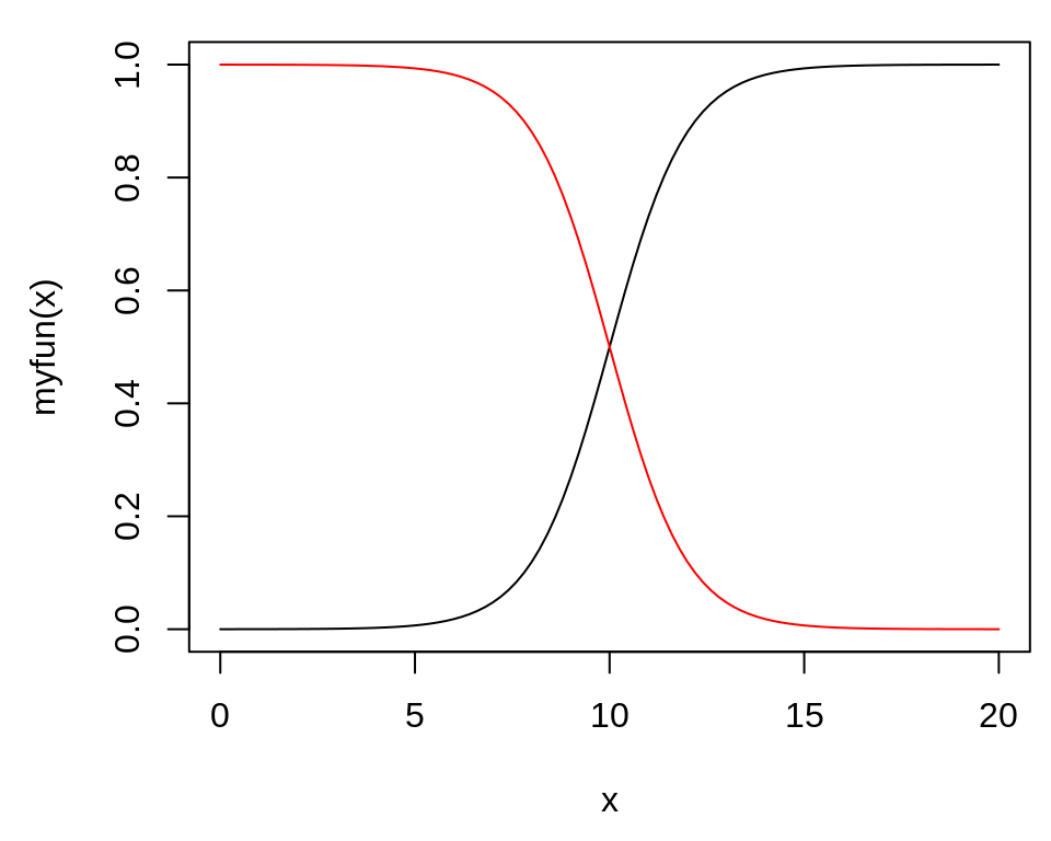
# Plot a user-defined function
myfun <- function(xvar) {
  1 / (1 + exp(-xvar + 10))
}
curve(myfun(x), from = 0, to = 20)
# Add a line:
curve(1 - myfun(x), add = TRUE, col = "red")
2.6.2 使用ggplot2包绘制功能曲线(stat_function(geom = “line”))
library(ggplot2)
# This sets the x range from 0 to 20
ggplot(data.frame(x = c(0, 20)), aes(x = x)) +
  stat_function(fun = myfun, geom = "line")