第三章 条形图(Bar Graphs)
条形图可能是最常用的数据可视化类型。它们通常用于显示不同类别(在x轴上)的数值(在y轴上)。举例来说,条形图可以很好地显示四种不同商品的价格。但是,条形图通常不适合显示随时间变化的价格(因为时间是一个连续变量)。
在制作条形图时,有一点需要意识到:条形图的高度有时候代表的是数据集中case的统计数目,而有时它们代表的则是数据集中具体的数值。由于count和value与具体数据间的关系有着很大的差异,因此可能会引起混淆。
3.1 创建一个简单的条形图
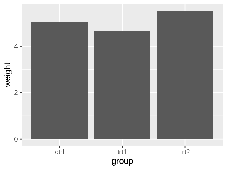
使用ggplot()中的geom_col(),并指定x和y轴的数据。
library(gcookbook)  # Load gcookbook for the pg_mean data set
ggplot(pg_mean, aes(x = group, y = weight)) +
  geom_col()
注:在早期的ggpolot2版本中,使用geom_bar(stat=”identity”)来创建条形图,而新版本则使用geom_col()。
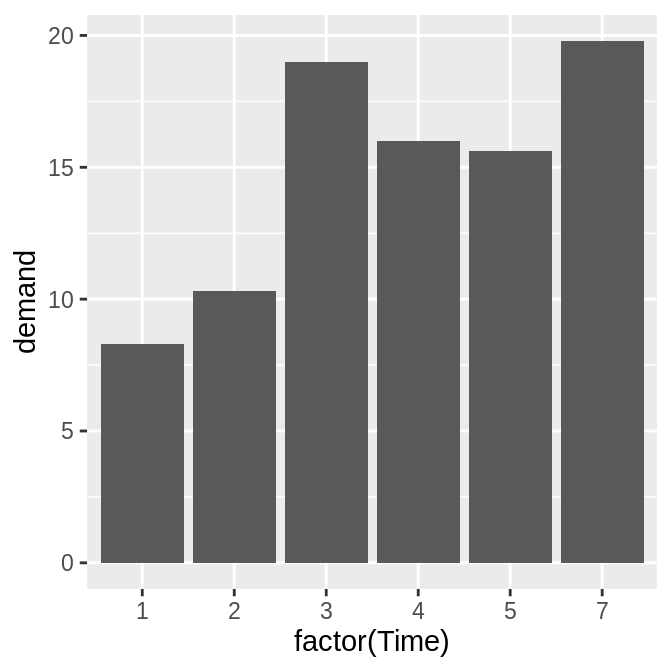
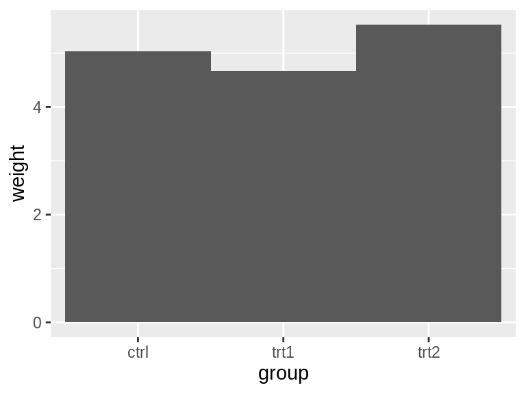
当x是一个连续型(或数字型)变量时,条形图的呈现会略有差异(比如下图x轴在6的地方出现了隔断)。此时可以利用factor()函数将连续型变量转换为离散型变量。
# There's no entry for Time == 6
BOD
#>   Time demand
#> 1    1    8.3
#> 2    2   10.3
#> 3    3   19.0
#> 4    4   16.0
#> 5    5   15.6
#> 6    7   19.8

# Time is numeric (continuous)
str(BOD)
#> 'data.frame':    6 obs. of  2 variables:
#>  $ Time  : num  1 2 3 4 5 7
#>  $ demand: num  8.3 10.3 19 16 15.6 19.8
#>  - attr(*, "reference")= chr "A1.4, p. 270"

ggplot(BOD, aes(x = Time, y = demand)) +
  geom_col()

# Convert Time to a discrete (categorical) variable with factor()
ggplot(BOD, aes(x = factor(Time), y = demand)) +
  geom_col()
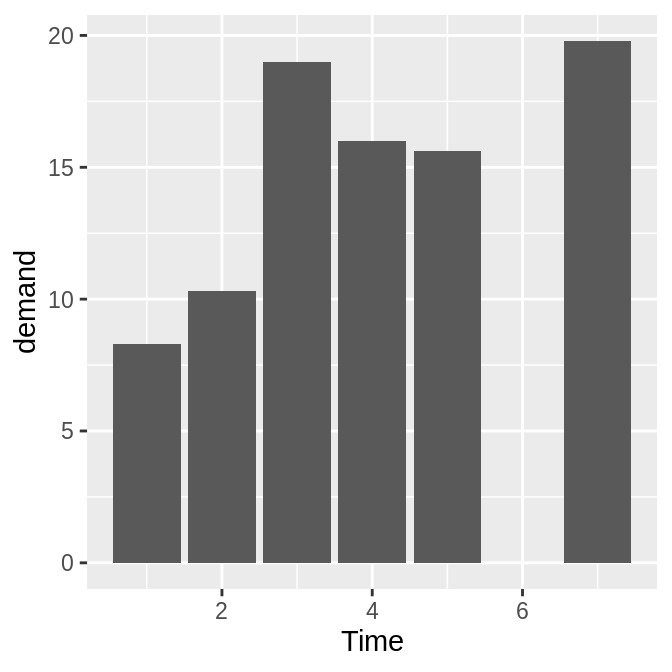
注意,BOD数据中并中没有Time = 6的行。当x为连续型变量时,ggplot2将使用一个数字轴,该轴会为最小值到最大值范围内的所有数值保留空间(在本图中,虽然x中没有6这一行,但是会保留该space)。
将Time数据转换为factor后,ggplot2会将其当作离散型变量来处理,该变量的值将被视为任意的标签(而非数字),因此它将不会在x轴上为最小值和最大值之间的所有可能数值分配空间。
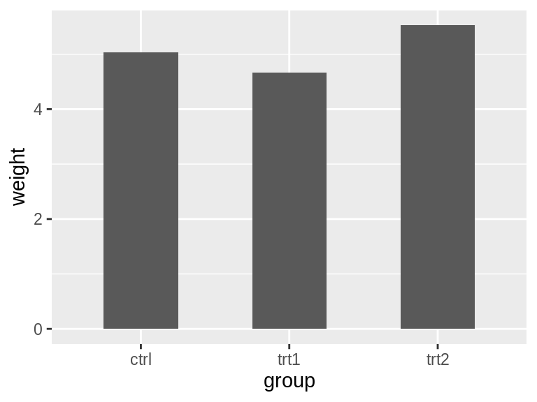
ggplot2中条形图的默认颜色为深灰色。若要更换颜色填充,可以利用fill参数进行修改。另外,默认情况下,填充的周围是没有轮廓的,若要添加轮廓,则需使用colour参数。
# 使用淡蓝色的fill和黑色的轮廓
ggplot(pg_mean, aes(x = group, y = weight)) +
  geom_col(fill = "lightblue", colour = "black")
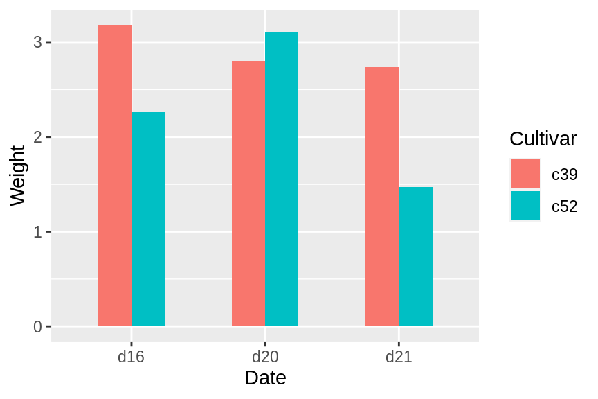
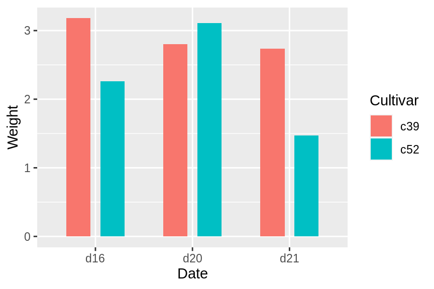
3.2 创建分组条形图(geom_col(position = “dodge”))
下面将使用cabbage_exp数据集进行演示,该数据包含两个分类变量(Cultivar和Date)和一个连续型变量(Weight):
library(gcookbook)  # Load gcookbook for the cabbage_exp data set
cabbage_exp
#>   Cultivar Date Weight        sd  n         se
#> 1      c39  d16   3.18 0.9566144 10 0.30250803
#> 2      c39  d20   2.80 0.2788867 10 0.08819171
#> 3      c39  d21   2.74 0.9834181 10 0.31098410
#> 4      c52  d16   2.26 0.4452215 10 0.14079141
#> 5      c52  d20   3.11 0.7908505 10 0.25008887
#> 6      c52  d21   1.47 0.2110819 10 0.06674995
我们将Date映射到x轴,将Weight映射到y轴,将Cultivar映射到fill color:
ggplot(cabbage_exp, aes(x = Date, y = Weight, fill = Cultivar)) +
  geom_col(position = "dodge")
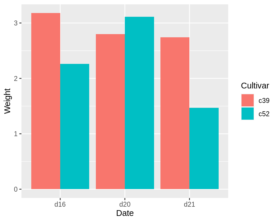
对于大部分的条形图来说,x轴一般为分类变量(categorical variable),y轴一般为连续型变量(continuous variable)。有时候我们还想引入另一个分类变量用于创建分组条形图,此时我们便可用position = “dodge参数来完成。
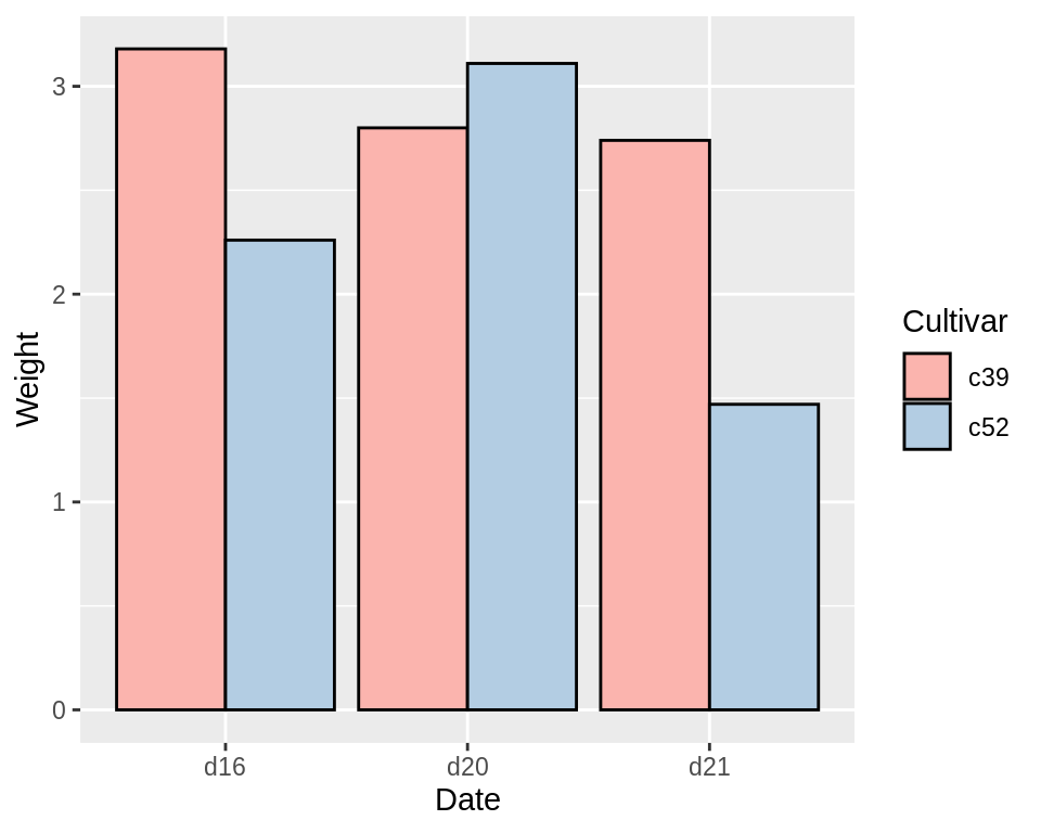
注意:条形图的x轴一定要是categorical variable,而非continuous variable。如果想给条形图绘制外框,可在geom_col()中加入参数colour=”black”。如果要设置条形图的颜色,则需使用scale_fill_brewer()或scale_fill_manual()参数。下图使用的是RColorBrewer中的Pastel1这个调色板:
ggplot(cabbage_exp, aes(x = Date, y = Weight, fill = Cultivar)) +
  geom_col(position = "dodge", colour = "black") +
  scale_fill_brewer(palette = "Pastel1")
创建基于计数(counts)的条形图
使用geom_bar()函数,但不映射任何值给y轴:
# Equivalent to using geom_bar(stat = "bin")
ggplot(diamonds, aes(x = cut)) +
  geom_bar()
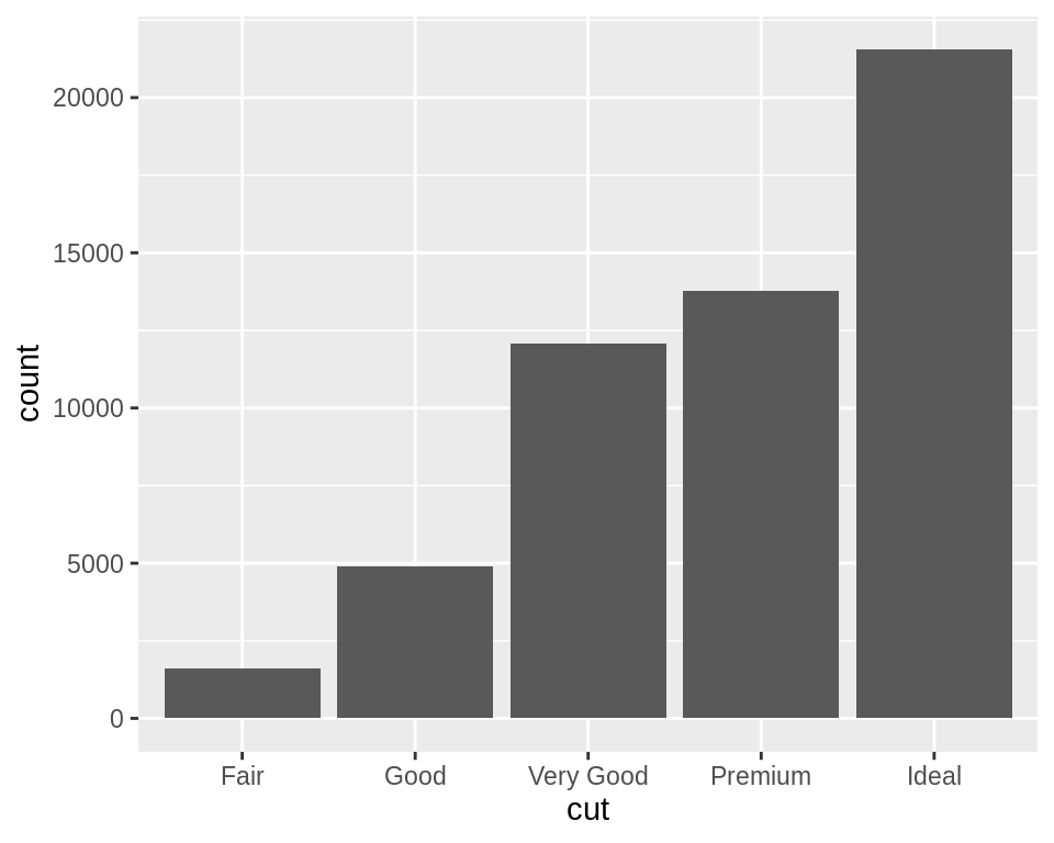
diamonds
#> # A tibble: 53,940 x 10
#>   carat cut       color clarity depth table price     x     y     z
#>   <dbl> <ord>     <ord> <ord>   <dbl> <dbl> <int> <dbl> <dbl> <dbl>
#> 1 0.23  Ideal     E     SI2      61.5    55   326  3.95  3.98  2.43
#> 2 0.21  Premium   E     SI1      59.8    61   326  3.89  3.84  2.31
#> 3 0.23  Good      E     VS1      56.9    65   327  4.05  4.07  2.31
#> 4 0.290 Premium   I     VS2      62.4    58   334  4.2   4.23  2.63
#> 5 0.31  Good      J     SI2      63.3    58   335  4.34  4.35  2.75
#> 6 0.24  Very Good J     VVS2     62.8    57   336  3.94  3.96  2.48
#> # … with 53,934 more rows
上图我们对diamonds数据集中的cut这一列进行了计数,并绘制了条形图,cut列是离散的。如果我们使用连续型变量进行计数条形图的绘制,则效果如下:
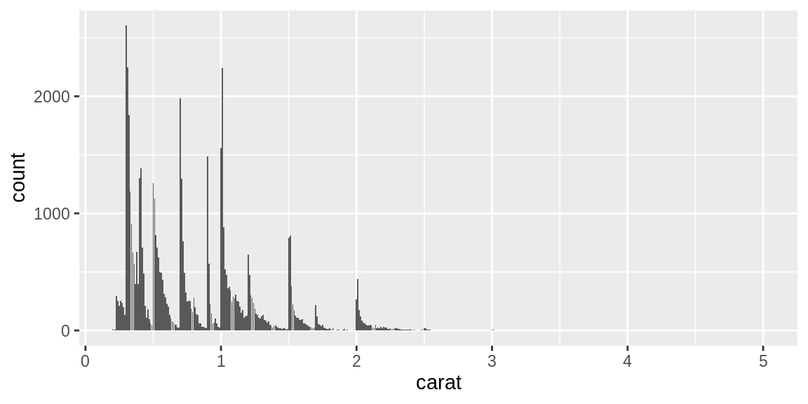
x轴连续的条形图类似于直方图,但不相同。在条形图中,每个条形表示一个唯一的x值,而在直方图中,每个条形表示一个x值的范围。
附录:条形图和直方图的区别
1、条形图是用条形的长度表示各类别频数的多少,其宽度(表示类别)则是固定的; 直方图是用面积表示各组频数的多少,矩形的高度表示每一组的频数或频率,宽度则表示各组的组距,因此其高度与宽度均有意义。
2、由于分组数据具有连续性,直方图的各矩形通常是连续排列,而条形图则是分开排列。
3、条形图主要用于展示分类数据,而直方图则主要用于展示数据型数据
在条形图中使用不同的颜色
此例我们将使用uspopchange数据集,其包含了美国从2000年到2010年的人口变化百分比。我们将使用人口增速最快的前十个州,并绘制出它们的百分比变化。我们还将按地区(东北,南部,中北部或西部)对条形进行着色。首选需要获得排名前十的州的数据:
library(gcookbook) # Load gcookbook for the uspopchange data set
library(dplyr)

upc <- uspopchange %>%
  arrange(desc(Change)) %>%
  slice(1:10)

upc
#>             State Abb Region Change
#> 1          Nevada  NV   West   35.1
#> 2         Arizona  AZ   West   24.6
#> 3            Utah  UT   West   23.8
#>  ...<4 more rows>...
#> 8         Florida  FL  South   17.6
#> 9        Colorado  CO   West   16.9
#> 10 South Carolina  SC  South   15.3
下面开始作图:
ggplot(upc, aes(x = Abb, y = Change, fill = Region)) +
  geom_col()
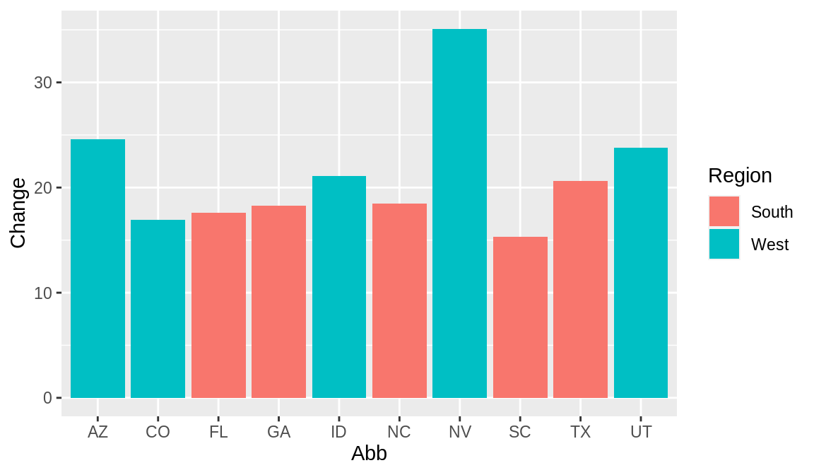
默认颜色为湖绿和西瓜红,若想更改条形图的颜色,可以使用scale_fill_brewer()函数或scale_fill_manual()函数。此例将使用scale_fill_manual()函数来更改颜色,使用colour=”black”来绘制条形图的外框颜色。
ggplot(upc, aes(x = reorder(Abb, Change), y = Change, fill = Region)) +
  geom_col(colour = "black") +
  scale_fill_manual(values = c("#669933", "#FFCC66")) +
  xlab("State")
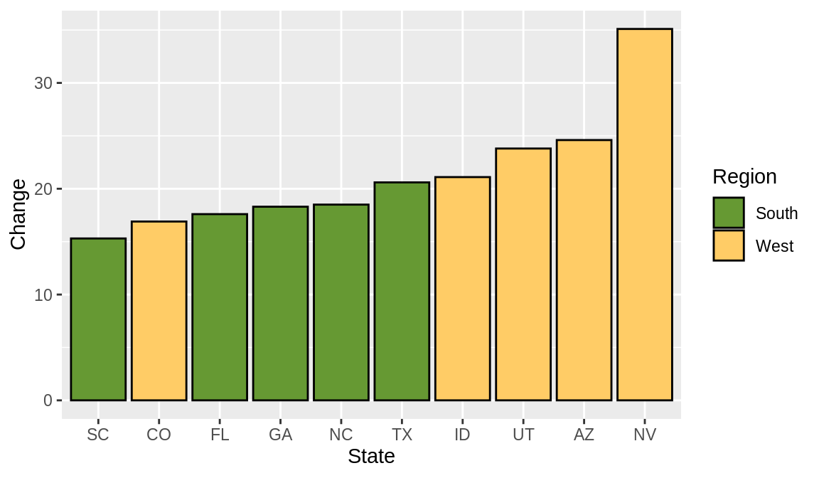
注意,在上述例子中,我们还使用了reorder()函数,基于Change的值来对factor Abb进行重新排序。由上图可知,相比于按照factor Abb的字母顺序,这种按照条形图高度进行排序的方式显得更加合理。
3.5 为正负条形图分别上色
我们将使用一部分气候数据,并创建一个称为pos的新列,该列可以指明该值是正数还是负数:
library(gcookbook) # Load gcookbook for the climate data set
library(dplyr)

climate_sub <- climate %>%
  filter(Source == "Berkeley" & Year >= 1900) %>%
  mutate(pos = Anomaly10y >= 0)

climate_sub
#>       Source Year Anomaly1y Anomaly5y Anomaly10y Unc10y   pos
#> 1   Berkeley 1900        NA        NA     -0.171  0.108 FALSE
#> 2   Berkeley 1901        NA        NA     -0.162  0.109 FALSE
#> 3   Berkeley 1902        NA        NA     -0.177  0.108 FALSE
#>  ...<99 more rows>...
#> 103 Berkeley 2002        NA        NA      0.856  0.028  TRUE
#> 104 Berkeley 2003        NA        NA      0.869  0.028  TRUE
#> 105 Berkeley 2004        NA        NA      0.884  0.029  TRUE
一旦我们获得了数据,便可以开始绘制条形图,我们使用position=”identity”参数,以防因负数而出现警告消息:
ggplot(climate_sub, aes(x = Year, y = Anomaly10y, fill = pos)) +
  geom_col(position = "identity")
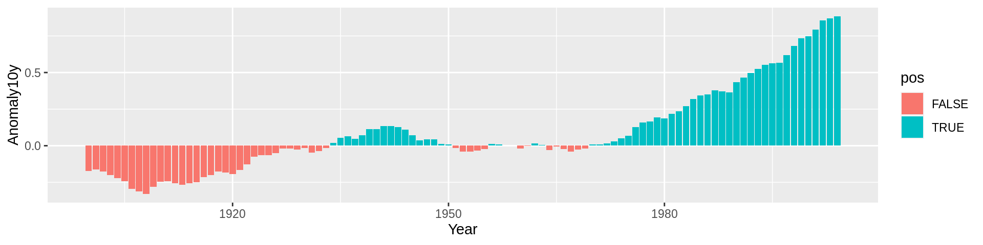
上图有几个问题:首先,颜色和我们所期望的相反,一般来说,红色代表热,蓝色代表冷;其次,图例是多余的。
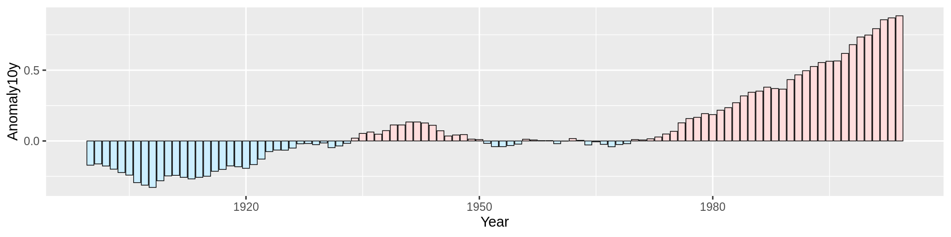
我们可以使用scale_fill_manual()参数来改变颜色,使用guide=FLASE来移除图例,使用colour参数来改变条形图的外框颜色,使用size参数来改变外框的粗细。
ggplot(climate_sub, aes(x = Year, y = Anomaly10y, fill = pos)) +
  geom_col(position = "identity", colour = "black", size = 0.25) +
  scale_fill_manual(values = c("#CCEEFF", "#FFDDDD"), guide = FALSE)
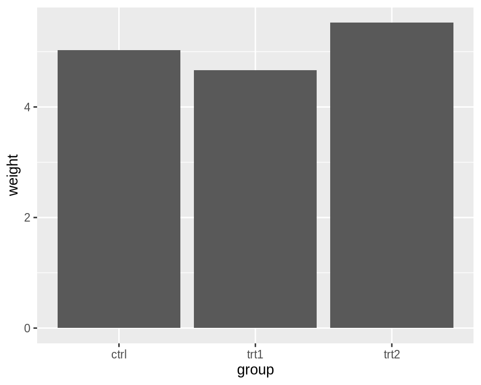
3.6 调整条形图的宽度和间距
标准宽度的条形图:
library(gcookbook) # Load gcookbook for the pg_mean data set

ggplot(pg_mean, aes(x = group, y = weight)) +
  geom_col()
细一些的条形图:
ggplot(pg_mean, aes(x = group, y = weight)) +
  geom_col(width = 0.5)
宽一些的条形图:
ggplot(pg_mean, aes(x = group, y = weight)) +
  geom_col(width = 1)
对于分组条形图来说,分组之间是默认没有间距的:
ggplot(cabbage_exp, aes(x = Date, y = Weight, fill = Cultivar)) +
  geom_col(width = 0.5, position = "dodge")
可以通过position_dodge()参数来增加间距:
ggplot(cabbage_exp, aes(x = Date, y = Weight, fill = Cultivar)) +
  geom_col(width = 0.5, position = position_dodge(0.7))
在默认的position=”dodge”中,默认间距为0.9,可以手动使用position=position_dodge(0.7)来改变间距。如果使整个图形变宽或变窄,则条形尺寸将成比例缩放。
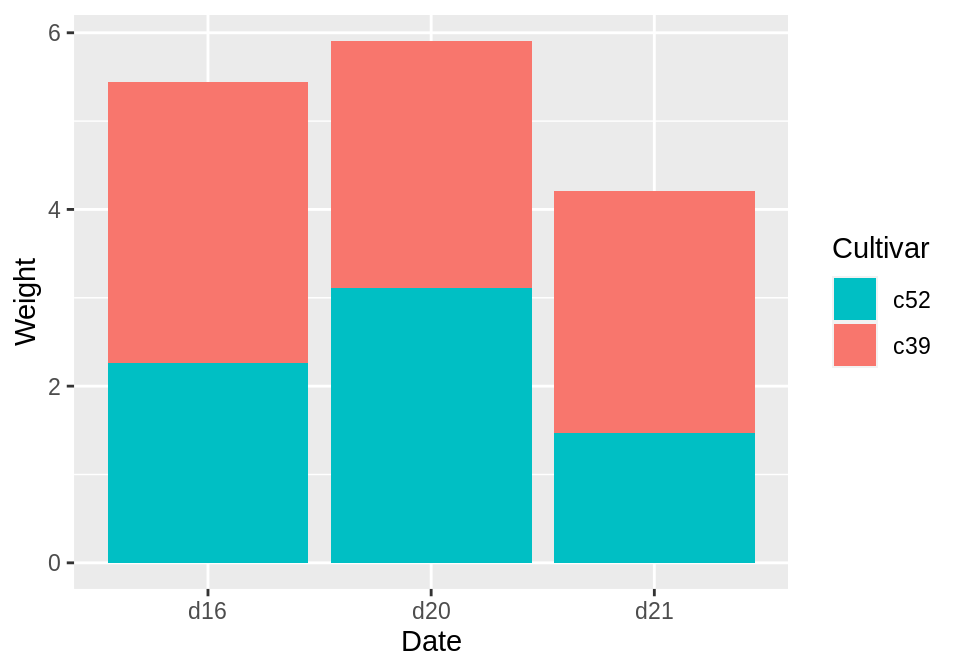
3.7 创建一个堆叠条形图
library(gcookbook) # Load gcookbook for the cabbage_exp data set

ggplot(cabbage_exp, aes(x = Date, y = Weight, fill = Cultivar)) +
  geom_col()

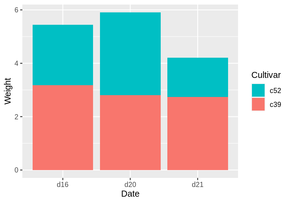
若想调换图例的顺序,则可以使用guides()函数中的fill=guide_legend参数:
ggplot(cabbage_exp, aes(x = Date, y = Weight, fill = Cultivar)) +
  geom_col() +
  guides(fill = guide_legend(reverse = TRUE))
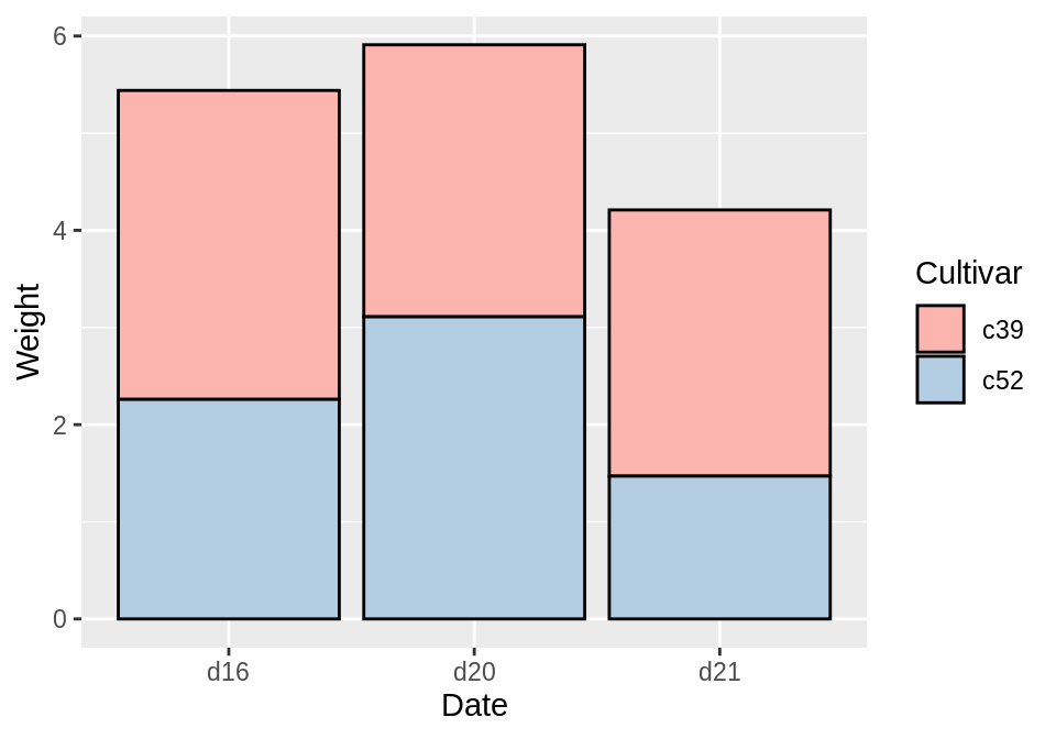
若想调换堆叠条形图的顺序,则可在geom_col()函数中使用position=position_stack参数:
ggplot(cabbage_exp, aes(x = Date, y = Weight, fill = Cultivar)) +
  geom_col(position = position_stack(reverse = TRUE)) +
  guides(fill = guide_legend(reverse = TRUE))
最后,还可以使用colour参数来改变外框颜色,使用scale_fill_brewer()函数来改变条形图的颜色:
ggplot(cabbage_exp, aes(x = Date, y = Weight, fill = Cultivar)) +
  geom_col(colour = "black") +
  scale_fill_brewer(palette = "Pastel1")
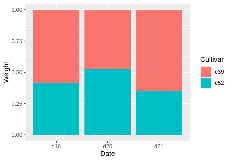
3.8 创建一个百分比堆积条形图
使用geom_col(position=”fill”)来绘制百分比堆积条形图:
library(gcookbook) # Load gcookbook for the cabbage_exp data set

ggplot(cabbage_exp, aes(x = Date, y = Weight, fill = Cultivar)) +
  geom_col(position = "fill")
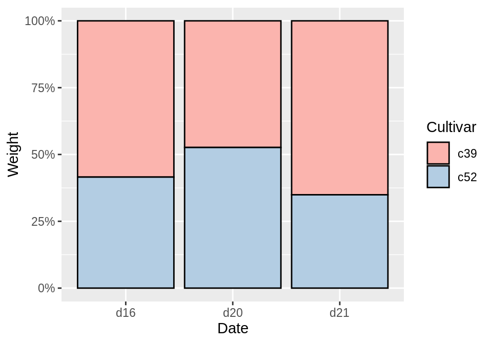
geom_col(position=”fill”)可以将y轴的值缩放至0到1之间,若要将标签也改为百分比,则可使用scale_y_continuous(labels=scales::percent):
ggplot(cabbage_exp, aes(x = Date, y = Weight, fill = Cultivar)) +
  geom_col(position = "fill") +
  scale_y_continuous(labels = scales::percent)
使用scales :: percent是一种使用scales包中的percent函数的方法。也可以改用library(scales),然后只用scale_y_continuous(labels = percent)。
为了让图片更加好看,可以加上外框并改变颜色:
ggplot(cabbage_exp, aes(x = Date, y = Weight, fill = Cultivar)) +
  geom_col(colour = "black", position = "fill") +
  scale_y_continuous(labels = scales::percent) +
  scale_fill_brewer(palette = "Pastel1")
与其让ggplot2自动计算比例,不如我们自己来计算比例的值。如果要在其他计算中使用这些值,这将很有用。我们首先需要将y轴的值缩放至100%,这可以通过group_by()和mutate()函数来完成:
library(gcookbook)
library(dplyr)

cabbage_exp
#>   Cultivar Date Weight        sd  n         se
#> 1      c39  d16   3.18 0.9566144 10 0.30250803
#> 2      c39  d20   2.80 0.2788867 10 0.08819171
#> 3      c39  d21   2.74 0.9834181 10 0.31098410
#> 4      c52  d16   2.26 0.4452215 10 0.14079141
#> 5      c52  d20   3.11 0.7908505 10 0.25008887
#> 6      c52  d21   1.47 0.2110819 10 0.06674995

# Do a group-wise transform(), splitting on "Date"
ce <- cabbage_exp %>%
  group_by(Date) %>%
  mutate(percent_weight = Weight / sum(Weight) * 100)

ce
#> # A tibble: 6 x 7
#> # Groups:   Date [3]
#>   Cultivar Date  Weight    sd     n     se percent_weight
#>   <fct>    <fct>  <dbl> <dbl> <int>  <dbl>          <dbl>
#> 1 c39      d16     3.18 0.957    10 0.303            58.5
#> 2 c39      d20     2.8  0.279    10 0.0882           47.4
#> 3 c39      d21     2.74 0.983    10 0.311            65.1
#> 4 c52      d16     2.26 0.445    10 0.141            41.5
#> 5 c52      d20     3.11 0.791    10 0.250            52.6
#> 6 c52      d21     1.47 0.211    10 0.0667           34.9
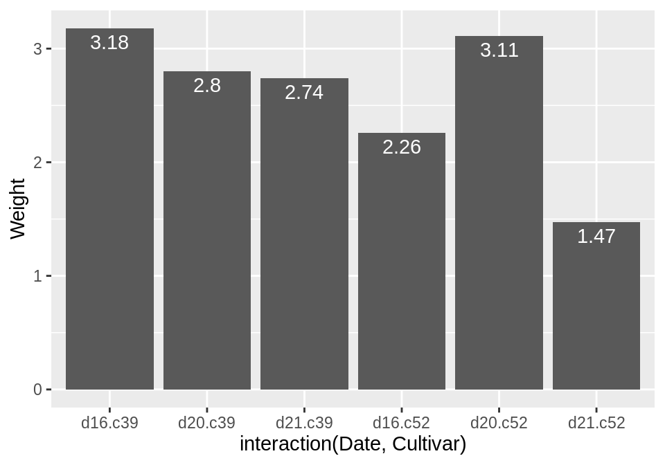
3.9 为条形图增加标签
通过geom_text()来为条形图增加标签,vset参数可以将标签移至条形图的上方或下方:
library(gcookbook) # Load gcookbook for the cabbage_exp data set
# Below the top
ggplot(cabbage_exp, aes(x = interaction(Date, Cultivar), y = Weight)) +
geom_col() +
geom_text(aes(label = Weight), vjust = 1.5, colour = "white")
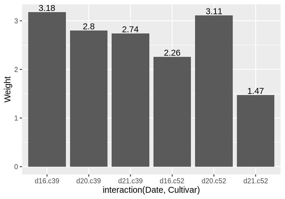
# Above the top
ggplot(cabbage_exp, aes(x = interaction(Date, Cultivar), y = Weight)) +
geom_col() +
geom_text(aes(label = Weight), vjust = -0.2)
如果想要给计数型条形图添加标签,则需使用geom_bar()和geom_text():
ggplot(mtcars, aes(x = factor(cyl))) +
  geom_bar() +
  geom_text(aes(label = ..count..), stat = "count", vjust = 1.5, colour = "white")
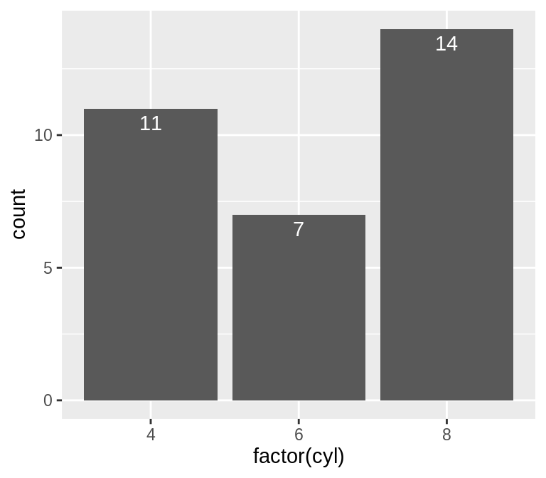
我们需要告知geom_text()来使用count值,并在x轴的条形图上增加相对应的标签,为了能使用计算后的count数作为标签,我们需要使用以下命令:aes(label= ..count..)。
此外,我们还可以根据以下命令来进一步修改标签的位置:
# Adjust y limits to be a little higher
ggplot(cabbage_exp, aes(x = interaction(Date, Cultivar), y = Weight)) +
  geom_col() +
  geom_text(aes(label = Weight), vjust = -0.2) +
  ylim(0, max(cabbage_exp$Weight) * 1.05)

# Map y positions slightly above bar top - y range of plot will auto-adjust
ggplot(cabbage_exp, aes(x = interaction(Date, Cultivar), y = Weight)) +
  geom_col() +
  geom_text(aes(y = Weight + 0.1, label = Weight))
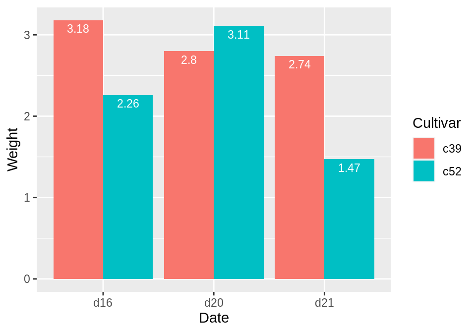
对于分组条形图来说,我们也需要设置position=position_dodge()并给出dodg的宽度(其默认宽度为0.9)。因为在分组条形图中柱子变窄了,所以我们需要将标签的字体也相应地改小一些:
ggplot(cabbage_exp, aes(x = Date, y = Weight, fill = Cultivar)) +
  geom_col(position = "dodge") +
  geom_text(
    aes(label = Weight),
    colour = "white", size = 3,
    vjust = 1.5, position = position_dodge(.9)
  )
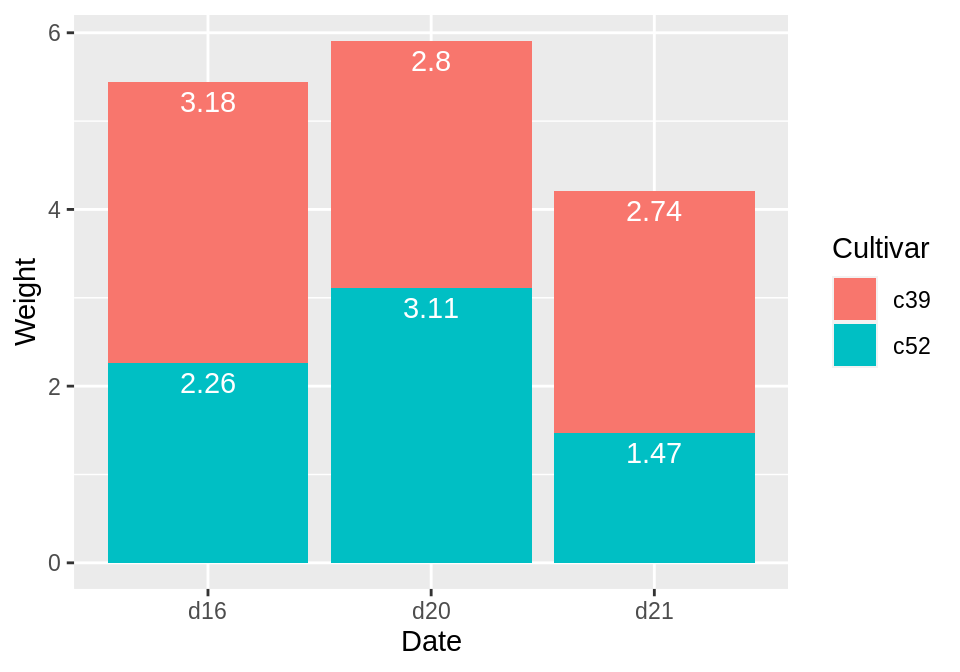
在堆叠条形图上放置标签需要找到每个堆叠的累积总和。为此,请首先确保对数据进行了正确的排序-如果数据排序不正确,则可能会以错误的顺序计算出累计总和。我们将使用dplyr包中的arrange()函数,注意,我们必须使用rev()函数对Cultivar进行倒序:
library(dplyr)

# Sort by the Date and Cultivar columns
ce <- cabbage_exp %>%
  arrange(Date, rev(Cultivar)) #先按照Date升序,再按照Cultivar降序
确定数据正确排序后,我们将使用group_by()函数将数据按照日期进行分组,然后在每个数据块中计算权Weight的累积总和:
# Get the cumulative sum
ce <- ce %>%
  group_by(Date) %>%
  mutate(label_y = cumsum(Weight))

ce
#> # A tibble: 6 x 7
#> # Groups:   Date [3]
#>   Cultivar Date  Weight    sd     n     se label_y
#>   <fct>    <fct>  <dbl> <dbl> <int>  <dbl>   <dbl>
#> 1 c52      d16     2.26 0.445    10 0.141     2.26
#> 2 c39      d16     3.18 0.957    10 0.303     5.44
#> 3 c52      d20     3.11 0.791    10 0.250     3.11
#> 4 c39      d20     2.8  0.279    10 0.0882    5.91
#> 5 c52      d21     1.47 0.211    10 0.0667    1.47
#> 6 c39      d21     2.74 0.983    10 0.311     4.21

ggplot(ce, aes(x = Date, y = Weight, fill = Cultivar)) +
  geom_col() +
  geom_text(aes(y = label_y, label = Weight), vjust = 1.5, colour = "white")
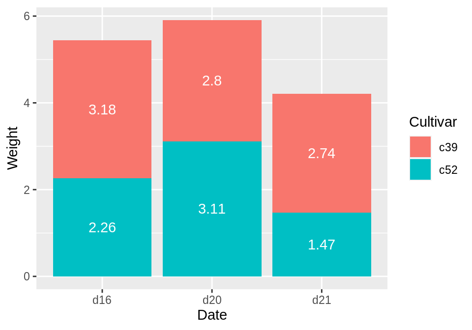
若要将标签放置在每个柱子的中间,则需要对累积总和进行调整:
ce <- cabbage_exp %>%
  arrange(Date, rev(Cultivar))

# Calculate y position, placing it in the middle
ce <- ce %>%
  group_by(Date) %>%
  mutate(label_y = cumsum(Weight) - 0.5 * Weight)

ggplot(ce, aes(x = Date, y = Weight, fill = Cultivar)) +
  geom_col() +
  geom_text(aes(y = label_y, label = Weight), colour = "white")
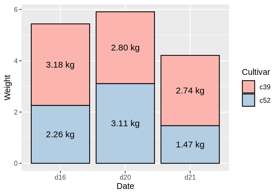
最后,我们还可以改变条形图的颜色、改变字体大小并使用paste参数在标签后增加“kg”。注意,若要保留小数点后两位数,则可使用format():
ggplot(ce, aes(x = Date, y = Weight, fill = Cultivar)) +
  geom_col(colour = "black") +
  geom_text(aes(y = label_y, label = paste(format(Weight, nsmall = 2), "kg")), size = 4) +
  scale_fill_brewer(palette = "Pastel1")
3.10 创建一个克利夫兰点图(Cleveland Dot Plot)
克利夫兰圆点图是条形图的一种替代图形,可以减少视觉混乱并使其更易于阅读。最简单的创建点图的方式是使用geom_point()函数:
library(gcookbook) # Load gcookbook for the tophitters2001 data set
tophit <- tophitters2001[1:25, ] # Take the top 25 from the tophitters data set

ggplot(tophit, aes(x = avg, y = name)) +
  geom_point()
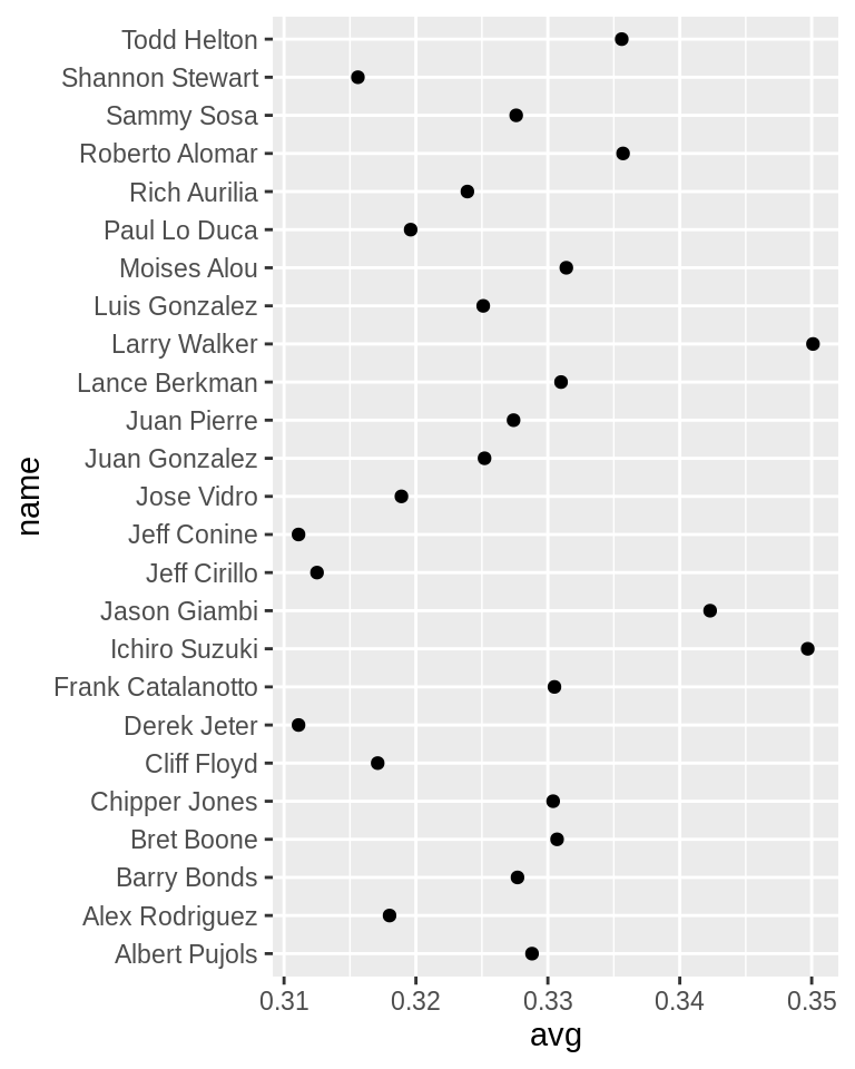
tophitters2001数据集中含有很多列数据,但我们仅关注其中的三列:
tophit[, c("name", "lg", "avg")]
#>             name lg    avg
#> 1   Larry Walker NL 0.3501
#> 2  Ichiro Suzuki AL 0.3497
#> 3   Jason Giambi AL 0.3423
#>  ...<19 more rows>...
#> 23  Jeff Cirillo NL 0.3125
#> 24   Jeff Conine AL 0.3111
#> 25   Derek Jeter AL 0.3111
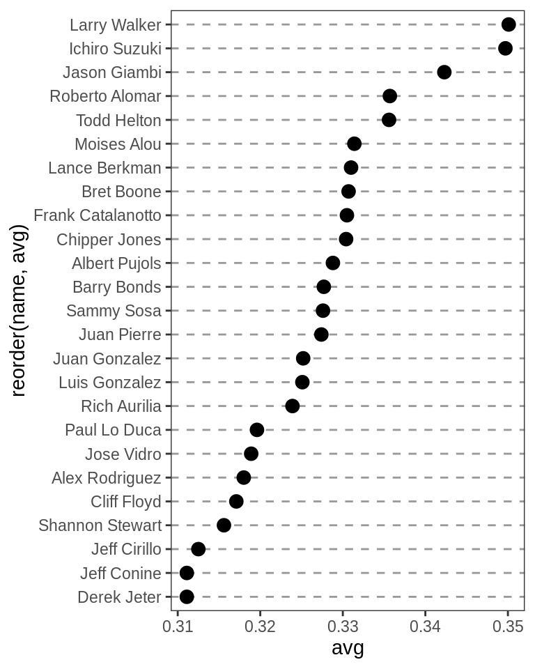
上图是按照字母顺序来排列的,但这并不利于图表的呈现。点图通常按水平轴上连续变量的值排序。name是一个字符向量,因此按字母顺序排列。如果是一个factor,它将使用factor level中定义的顺序。在这种情况下,我们希望按不同的变量avg对名称进行排序。
为了实现上述目的,我们需要使用reorder(name,avg),这会将name列转换为factor,并基于avg列对其进行排序。为了进一步改善外观,我们将使用主题系统使垂直网格线消失,然后将水平网格线变为虚线:
ggplot(tophit, aes(x = avg, y = reorder(name, avg))) +
  geom_point(size = 3) +  # Use a larger dot
  theme_bw() +
  theme(
    panel.grid.major.x = element_blank(),
    panel.grid.minor.x = element_blank(),
    panel.grid.major.y = element_line(colour = "grey60", linetype = "dashed")
  )
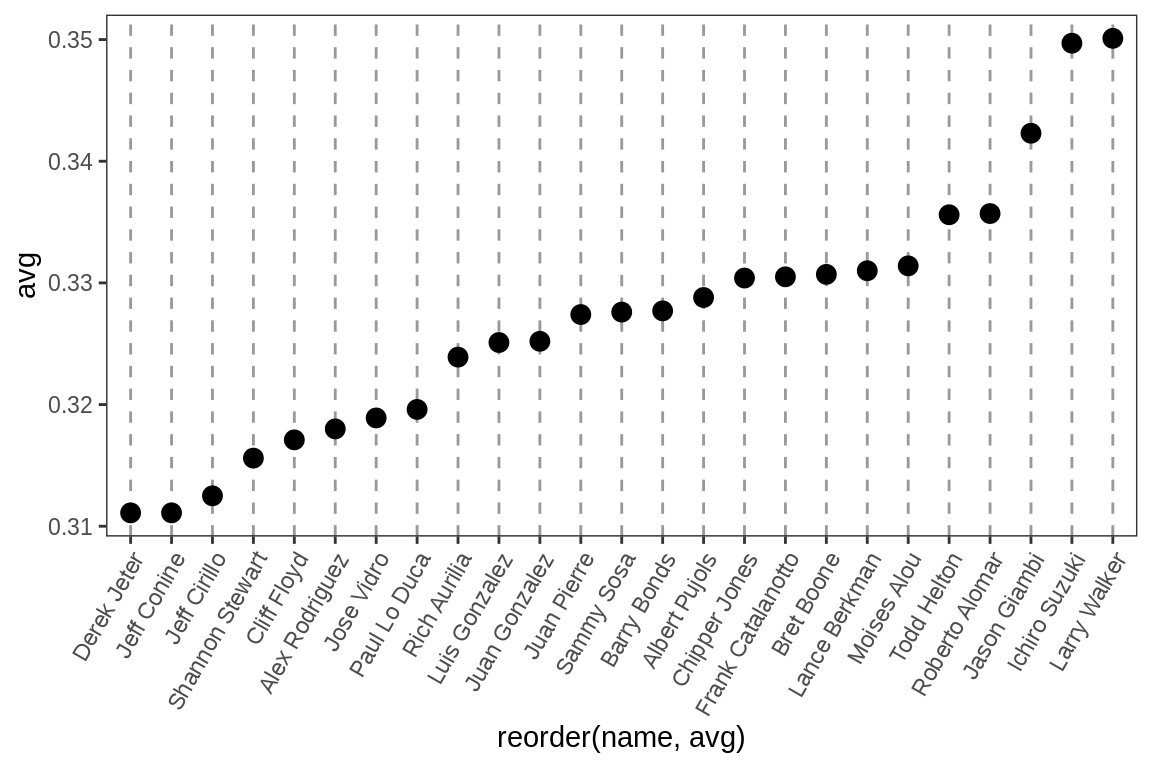
也可以交换轴,以使名称沿x轴移动,而值沿y轴移动。我们还将文本标签旋转60度:
ggplot(tophit, aes(x = reorder(name, avg), y = avg)) +
  geom_point(size = 3) +  # Use a larger dot
  theme_bw() +
  theme(
    panel.grid.major.y = element_blank(),
    panel.grid.minor.y = element_blank(),
    panel.grid.major.x = element_line(colour = "grey60", linetype = "dashed"),
    axis.text.x = element_text(angle = 60, hjust = 1)
  )
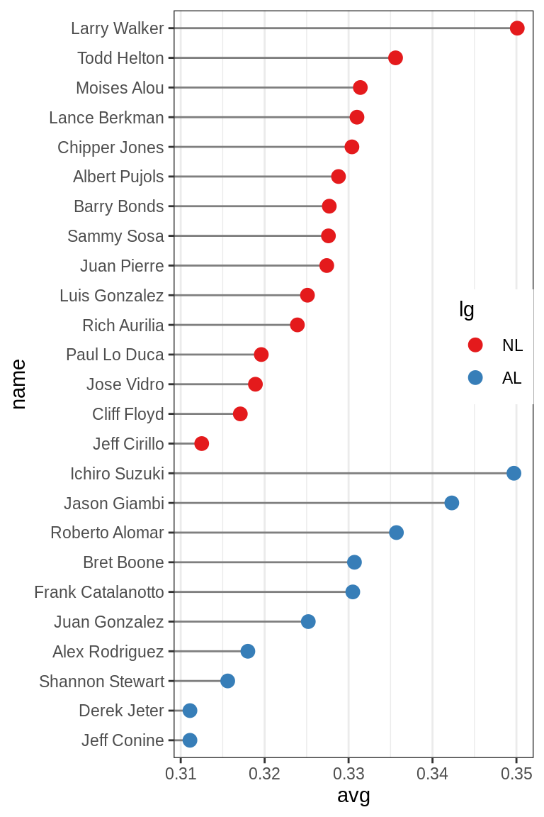
有时也需要按另一个变量对项目进行分组。在这种情况下,我们将使用factor lg,其具有NL和AL这两个level,分别代表国家联盟和美国联盟。这次我们要先按lg排序,然后再按avg排序。遗憾的是,reorder()函数只能按另一个变量对factor levels进行排序。要通过两个变量对因子水平进行排序,我们必须手动进行:
# Get the names, sorted first by lg, then by avg
nameorder <- tophit$name[order(tophit$lg, tophit$avg)]

# Turn name into a factor, with levels in the order of nameorder
tophit$name <- factor(tophit$name, levels = nameorder)
此外,我们还需要将lg映射至不同的点的颜色。这次,我们将使用geom_segment()函数。请注意,geom_segment()需要x,y,xend和yend的值:
ggplot(tophit, aes(x = avg, y = name)) +
  geom_segment(aes(yend = name), xend = 0, colour = "grey50") +
  geom_point(size = 3, aes(colour = lg)) +
  scale_colour_brewer(palette = "Set1", limits = c("NL", "AL")) +
  theme_bw() +
  theme(
    panel.grid.major.y = element_blank(),   # No horizontal grid lines
    legend.position = c(1, 0.55),           # Put legend inside plot area
    legend.justification = c(1, 0.5)
  )
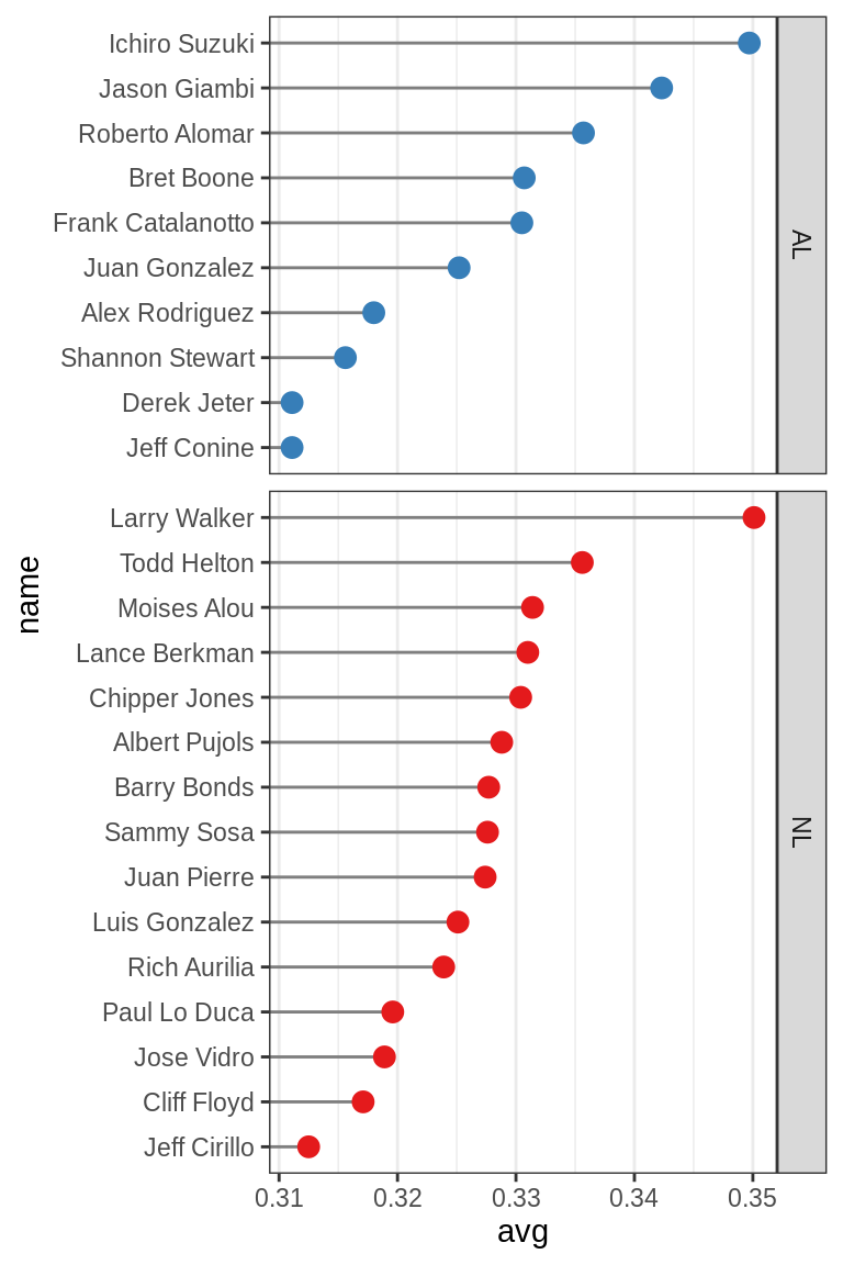
分离两组的另一种方法是使用facets:
ggplot(tophit, aes(x = avg, y = name)) +
  geom_segment(aes(yend = name), xend = 0, colour = "grey50") +
  geom_point(size = 3, aes(colour = lg)) +
  scale_colour_brewer(palette = "Set1", limits = c("NL", "AL"), guide = FALSE) +
  theme_bw() +
  theme(panel.grid.major.y = element_blank()) +
  facet_grid(lg ~ ., scales = "free_y", space = "free_y")